Brand.ai

Client
Brand.ai (InVision DSM)

The Challenge

The objective was to create documentation and tutorial videos for Brand.ai’s Sketch plugin.

Key Goals

The value of Brand.ai is to share design assets with an entire team and summarize design decisions through the Style Guide. While exploring Brand.ai’s onboarding components, I found that the user had little understanding of how Sketch assets could be used in the style guides generated by Brand.ai. As a new user, it would be difficult to realize the full value proposition provided by Brand.ai as a User Experience Designer or Product Manager. Brand.ai wanted to position itself as an internal design system for product teams but users only understood the asset syncing feature the product offered. For Brand.ai, it was important to show practical use-cases of the product outside of Sketch asset-syncing to demo its feature-complete design system.

To accomplish that, it was important to highlight the following:

  • Sketch-to-Brand.ai integration
  • Style Guide creation and management
  • Data endpoints for advanced integration

Narrowing the Scope

It was important to cover topics that were useful to the user. Since the client’s budget allowed for six videos and help documentation guides I had to focus in on what to deliver. Working with the company, I decided on six topics:

  1. Getting Started (Broad introduction and overview)
  2. Developing Your Design Library 3. Collaborating with Brand.ai
  3. The Brand.ai Dashboard
  4. Sketch Workflow
  5. Exporting Style Data and Developer APIs

Building on an Existing Brand

I first built an introduction animation to put across the series of help videos. Using a mockup I designed in Sketch, I was able to see the two different states I wanted the video to begin and end in.

I worked on morphing the logomark into the full-sized logo using After Effects. By transitioning and adding points to go from a circle to a rectangle, I communicated the two different logos that represented the company.

Developing a Workflow

To create sensible help documentation, a consistent approach needed to apply to each video. A good help video needs to define the topic, explain the use-case, and demonstrate the solution. Following this approach, I wrote scripts to communicate these stages.

When demonstrating how the software worked in the form of a video, it was necessary to increase accessibility in the video demonstrations. That means the cursor needed to be easy-to-see, its motion needed to be fluid, and elements that were in-focus needed to be presented in full-view to the user. Simply recording a QuickTime screen recording and cutting it up in Premiere Pro would not work well.

Using Camtasia’s hidden cursor feature, I replaced the cursor with one I mocked up. You can see below how this method made in-focus elements easier to view:
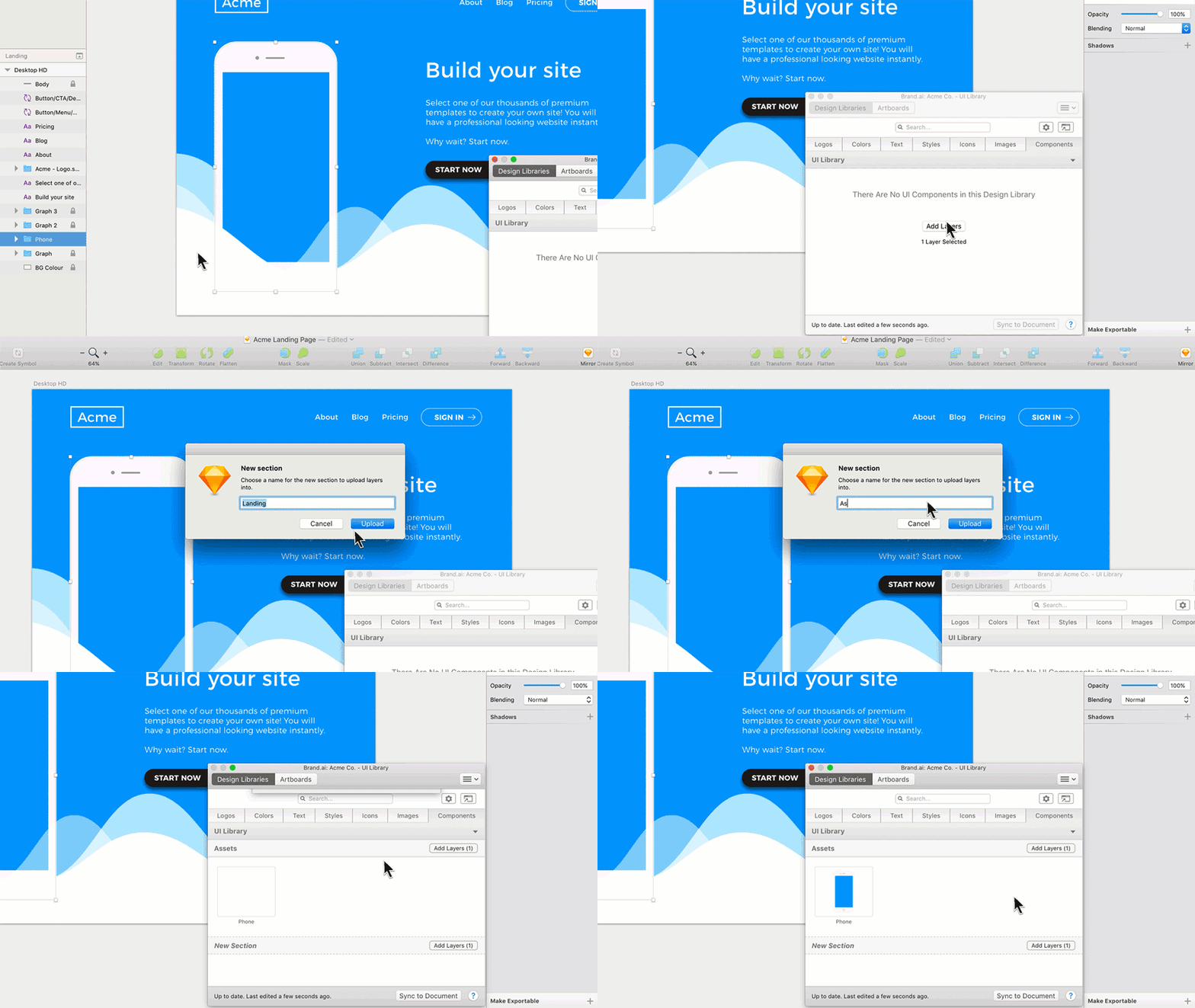
After discovering how to animate the cursor, I moved onto getting the necessary voiceovers from a voice artist and recorded the actions I wrote in the script.

The Result

Here’s part one of the series I created for Brand.ai.

Also, here’s the documentation article I wrote.

Summary

By understanding Brand.ai’s value proposition and how it was communicated, I was able to create useful help guides for its platform. I built a delightful animation that transformed the logomark into Brand.ai’s full logo. Most importantly, my documentation showed use-cases and the topics important to Brand.ai’s clients. Although there were some technical challenges such as achieving the accessibility needed to make the cursor visible, it was overcome using a novel cursor-replacement technique.

This series of six help documentation articles and videos helped make available more resources for the growing Brand.ai software. By implementing this documentation, it helped ease some pain-points of Brand.ai and make visible the value of the platform.

No items found.
No items found.

Got a project in mind?

Contact me and let's work together!